【本文已正式发往TJC】一篇打算发在TJC的长文,关于旗鱼2.x UI的看法。先在这打个草稿
-
My Other opinions on Sailfish 2.x UI
In my opinion, the most remarkable shortcoming of Sailfish 1.x UI is that the multitasking view(home screen) was limited to 9 covers. In Sailfish 2.x the limitation is solved, but I think some of other benefits were lost at the same time. For these, I have a solution to the limitation of 9 covers without change a lot from the 1.x style. I will talk about them in details below. First I want to talk about some of my opinions on Sailfish 2.x UI.
1. Opinions on the position of Events View: I have already talked something about it, and there may be some more I can talk. First, I think putting the Events View beside multitasking view is not a good idea for Sailfish UI. I know some people may like it because this design is similar with the Harmattan style(Swipe UI style). But, I have to say, changing it back to the Harmattan style is really less efficient on Sailfish UI. In my opinion, swiping up from button to enter the Events View is a great improvement on Sailfish 1.x, which is much more efficient than the Harmattan way, as you need 2 steps to go to the Events View when you are in a running app on Harmattan. Sailfish comes from MeeGo, but it should be better than previous MeeGo. Since I think Events View should get higher priority, Sailfish 2.x UI may not get really better than the Harmattan UI, while Sailfish 1.x do. Another thing about this is the Setting shortcuts. In Harmattan, the setting shortcuts can be reached by tapping on the top panel, but in Sailfish(2.x), the setting shortcuts is in the Events View, as Sailfish doesn’t have a global top panel. It is acceptable not to have a global top panel in Sailfish, but in order to be more easily to reach the setting shortcuts, the “swipe up from buttom to enter Events View” way(Sailfish 1.x) is much better than “putting the Events View beside the home screen” way(Sailfish 2.x).
Some people may say that I can choose the “Quick Event access” option in the Settings and enter the Events View by swiping from the left edge. Well, first, indeed you can use this option to enter the Events View quickly, but after you finish reading your notifications, you may want to go back to the previous app - and this may need at least 2 steps in Sailfish 2.x, while in 1.x you just need to swipe up again for going back to where you came from. Next, I think the "Quick Event access" option is not a good solution for single-hand users. For right-hand users, this option may not be easy to use, as it may not be easy for their finger to reach the left edge of the screen. And for left-hand users, swiping in their easy way(from left edge) may always take them to the Events View, and they have to swipe again or use their uncomfortable gesture(swiping from right edge) to reach the home screen. Therefore, I think it is really a bad idea to have asymmetric gestures in a mobile UI(in this situation, the asymmetry means swiping from the left edge and swiping from the right edge bring you to different places), and the Sailfish 1.x UI doesn't have these problem. In conclusion, instead of choosing “Quick Event access” in settings, the “swipe from bottom to enter and quit Events View” way is a much better solution.What’s more, “putting the Events View beside the home screen” might affect some other things: the ambience setting and the screen lock gesture. In Sailfish 1.x, swiping from the left or the right edge in the home screen brings you to the quick ambience setting. While in Sailfish 2.x, I guess that because the Events View occupies the side of the home screen, the ambience setting have to find another place to get. Jolla’s solution is to put the ambience setting in the pull down menu, which also includes the screen lock option. As a result, we need 2 steps to lock the screen from the home screen (as well as the Events View and the lock screen). But, if we change back to the “swipe up from bottom to enter Events View” way, the ambience setting can go back to its old position(beside the home screen), and swiping from the top of the home screen will have only one option: lock the screen, which is really a fast action. I know I can use the Restore Swipe to Lock patch in Sailfish 2.x, but if the swipe down gesture is in the 1.x style, why do I need this patch?
Here is a video showing the 1.x style ambience settings and locking screen(from 0:51)
2. About losing of home screen shortcuts: These shortcuts means the four icons at the bottom of the home screen in Sailfish 1.x, which disappeared in Sailfish 2.x. Some people might not care about them, but for me, these shortcuts bring a lot of convenience. Also, some people may say that the shortcuts occupy the bottom position of the home screen, which might be one of the reasons why the multitasking is limited to 9 covers. Don’t worry, I have my own solution to that. In my solution, these shortcuts will play an important role.
My solution to the limitation of 9 covers and my ideal Sailfish gestures on home screen
My solution is mainly based on Sailfish 1.x home screen, so the sample image I use is from the Jolla User Guide based on Sailfish 1.0. It’s OK to have a 2.x style panel at the top of the home screen.

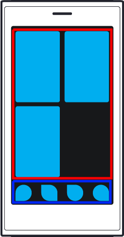
First we divide the home screen into 2 areas: the red area includes the covers of running apps, and the blue area is where the shortcuts occupy. The solution is quite easy: if you have more than 9 covers in the home screen, swiping up and down in the red area will browse the covers; while swiping up from the blue area(exclude the bottom edge of the screen) will bring you to the Launcher. Swiping up from the bottom(edge) of the screen will be different from swiping from the blue area – which brings you to the Events View.
Finally I will talk about my ideal Sailfish gestures on home screen, which is really similar to the 1.x style.

Again, the sample image is from the Jolla User Guide based on Sailfish 1.0. It’s OK to have a 2.x style panel on the top of the home screen.
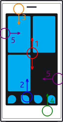
Gesture 1 (Swipe up and down in the apps cover area): Browse the covers when more than 9 apps are open.
Gesture 2 (Swipe up from the shortcuts area): Go to the Launcher.
Gesture 3 (Swipe down from the top of the screen): Lock screen.
Gesture 4 (Swipe up from the bottom of the screen): Go to the Events View.
Gesture 5 (Swipe from the left or the right edge fo the screen): Go to quick ambience setting.
Sadly, I know that it might be too late to talk about the Sailfish UI now, as Sailfish 2.x has released for more than 2 years. And I don't mean I want to change all the things back to 1.x style. What I'm talking about is just the home screen layout and gestures and the way to enter the Events View. I know if the UI changed a lot again, some of the apps, especially some patches for Sailfish 2.x that lots of great developers made will no longer work. So, if the UI can’t change a lot again, at least I hope that the “swipe up from buttom to enter Events View” will come back. Even putting the Launcher beside the home screen instead of putting Events View there is more acceptable for me (if most people choose the “Events View” in my poll).
-
翻译
标题:对Sailfish 2.x UI的看法和小调查(也许现在已经太晚了)
Sailfish OS从1.x升到2.x已经过了2年多的时间了,UI在这一升级中经历了很大变化。部分人可能对新的UI风格更喜欢,但也有一些人比如我更喜欢1.x。对我来说,最不适应的一个大变化之一是“底部上滑”手势的变化,1.x这个手势是前往通知界面,而2.x是前往应用列表。在我个人看来,通知界面应该比应用列表有更高的优先级,尤其在如今通知界面的顶端已经加入了许多快捷设置的情况。能够在任何界面都快速进入通知界面的方式对我来说很友好(我知道在Sailfish 2.x中可以在设置里选择“快速访问‘事件’”选项并从左边缘滑动来进入通知界面,但作为一个单手用户,这种方式令我感到很难受。这点我后面还会说)。应用列表的重要性对我来说要低一些,因为在主屏上我已经有了已开启应用的卡片,通过卡片我可以很容易地切换应用。对于开启新的应用,我认为先返回主屏后进入应用列表的方式是可接受的。然而,我并不确定大部分的旗鱼粉是否和我持有相同的观点,因此我在这做个小调查(点击下面的链接为你的选择投票):
你更希望底部上滑手势是进入什么界面呢(或者说你认为通知界面和应用列表哪个应该更优先)?
选项在下面的头两个Answer中列出。直接对你选择的选项投票即可(咱论坛没这个,等发到TJC上大家就明白了)
如果大部分人希望通过这个手势进入通知界面,我想Jolla确实应该考虑把这个手势改回1.x的方式了(虽然看起来在Sailfish 2.x发布2年后再谈论此事有些太晚了)。
另外我还有一些对Sailfish 2.x UI的其他看法。我将以另一个Answer的形式写在下面。
P.S.: 一个演示Sailfish 1.x进入Events View的视频,来自油管,需要梯子:
【投票选项,到时在TJC上投票的话直接点vote就好】
第一个Answer:
通知界面应该比应用列表更优先
第二个Answer:
应用列表应该比通知界面更优先
-
在我看来,Sailfish 1.x UI 最令人在意的缺陷是多任务界面(主屏)上的卡片被限制为9个。在Sailfish 2.x上这个限制被解决了,但许多优势也丢失了。对此,我有一个对1.x不做大量改动就解决多任务限制的方法,我会在下面一并详细讲。首先我先谈谈我对Sailfish 2.x UI的一些看法
1、关于通知界面位置的意见:这个我在上面已经说了一些了,但我还有另外一些想说的。我认为把通知界面放到主屏的旁边对Sailfish的UI来说并不是一个好主意。我知道有些人可能对这个主意比较喜欢,因为这个设计有些类似Harmattan的风格(即Swipe UI风格)。但是,我不得不说,在Sailfish UI中把这点按照Harmattan的方式来模仿着实降低了效率。我认为,底部上滑进入通知界面在是Sailfish 1.x上的一个巨大进步,它的效率是要远高于Harmattan的方式的,因为在Harmattan上当你在其他应用里时进入通知界面需要花两步。Sailfish 源自MeeGo,但它应当比以前的MeeGo更好。因此我认为把通知界面放到Harmattan风格的地方不是个好主意。另一个关于此的则是设置项快捷方式(注:这里不知道怎么翻译比较好……其实就是包括快捷开关和一些其他设置项)。在Harmattan中,快捷设置可以通过点击顶栏来进入,而在Sailfish(2.x)中,快捷设置则是在通知界面里,毕竟Sailfish并没有一个全局的顶栏。Sailfish没有全局顶栏这没关系,但要快速进入快捷设置的话,上滑进入通知(Sailfish 1.x)还是要比把通知界面放到主屏旁边(Sailfish 2.x)要好很多的。
有些人会说我可以在设置中开启“快速访问‘事件’”选项。关于这个,首先,确实你可以通过这个选项快速进入通知界面,但当你看完通知后可能需要返回之前的应用——在Sailfish 2.x中这一操作要花费两步,而在1.x中你只要再次上滑就可以回到你之前的地方了。另外,我认为“快速访问‘事件’”这个选项对于单手用户来说是个相当糟糕的主意。对右手用户来讲,这个选项并不好用,因为去触摸屏幕的左边缘或许不是那么容易。而对左手用户来说,这个选项将使他们用比较易于操作的手势(从左边缘滑动)时总进入通知界面,而要进入主屏他们要么就得再滑一次,要么就得用不易于操作的手势(从右边缘滑动)。作为结论,我认为在移动设备上使用一套不对称的手势是个很糟糕的主意(在这个意思中,“不对称”的含义是从左侧边缘滑动和从右侧边缘滑动将进入不同的界面)。因此相比开启“快速访问‘事件’”选项,底部上滑来进入通知界面是一个更好的解决办法。另外,把通知界面放到主屏旁边可能还影响了其他的一些东西:氛围设置和锁屏手势。在Sailfish 1.x中,从主屏的左右边缘滑动将进入快捷氛围设置。而在Sailfish 2.x中,我想也许是通知界面占用了主屏的左右位置,快捷氛围设置只能找其他的地方来放。Jolla的解决方式是把它放到下划菜单中,即同时包含了锁屏选项的地方。这就导致我们要从主屏/通知界面/锁屏界面锁屏的话就要花费两步。但如果我们恢复了上滑进入通知界面的方式,氛围设置就能回到它以前的地方,顶部下划也将只有一个操作:锁屏。当然我知道我可以在Sailfish 2.x上使用Restore Swipe to Lock这个补丁,但如果下滑手势本来就是1.x的方式,我又何必使用这个补丁呢?
一个演示Sailfish 1.x中快捷氛围设置和锁屏手势的视频(从 0:51 开始,同样来自油管需要梯子)
2、关于主屏快捷方式消失:这个快捷方式指的是Sailfish 1.x 主屏底部的四个图标,它们在Sailfish 2.x中消失了。有些人对这个可能并不在意,不过对我来说这几个快捷方式还是可以给我不少方面的。也有人会说,这四个快捷方式占据了主屏底部的位置,这也许是多任务被限制到9个卡片的原因之一。这一点不用担心,我想出了一个解决方式。而且在这上解决方式中快捷方式还扮演了重要角色
我对主屏9卡片限制的解决方式和我理想中的Sailfish 主屏手势
我的解决方式大体上基于Sailfish 1.x,因此示例图片是从基于Sailfish 1.0版本的Jolla用户手册中提取的。你可以认为在主屏顶部有加上2.x风格的顶栏。

首先我们把主屏分为两部分:红色区域包含了已开启应用的卡片,蓝色区域则是快捷方式占用的区域。解决方式非常简单:当你开启了超过9个应用时,在红色区域中上下滑动就可以浏览多任务卡片;从蓝色区域上滑(不包括底部边缘)则进入应用列表。同样,底部(边缘)上滑和从蓝色区域上滑将是不同的——它将带你进入通知界面。
最后我将展示我理想中的Sailfish 主屏手势,其实这非常接近于Sailfish 1.x风格。

一样,示例图片来源于基于Sailfish 1.0的Jolla用户手册。你可以认为主屏顶部有加上2.x风格的顶栏。
手势1(在多任务卡片区域上下滑动):当开启超过9个应用时,浏览多任务卡片
手势2(从快捷方式区域上滑):进入应用列表
手势3(顶部下滑):锁屏
手势4(底部上滑):进入通知界面
手势5(从左右边缘滑动):进入快捷氛围设置
遗憾的是,我了解在Sailfish 2.x发布超过2年后再谈论Sailfish UI可能已经太晚了。如果UI再次大改的话,许多优秀的开发者做的应用(比如补丁)将无法再使用。如果UI以后不能再大改的话至少我希望上滑进入通知界面这点能够回归。甚至把应用列表放到主屏旁边都比通知界面放到旁边对我来说要更合适(当然如果大部分人在我的调查中选择“通知界面”这个选项的话)。
-
快捷开关需要在通知界面下划是我唯一觉得有点麻烦的地方,其他还好。
话说不知道SONY还会不会继续适配自家机型 -
@all-to-be-nice 还是1.0的时候方便,随时随地的从底部上划就看到事件界面,不松开手再下划回去继续刚才的操作。
-
@all-to-be-nice 确实有这方面问题。不过快捷设置占的空间确实太大,这也算是一种妥协了。
-
-
@birdzhang 唉?字体大小是怎么设置的?用的是一级标题?
-
@天苯 嗯,
# 后面加链接 -
确实我也喜欢1的。
-
突然想到似乎旗鱼原生应用对于通知的需求(新闻类除外)不是特别高,安卓就不是了,不知道Jolla官方把2.0之后优先了应用是不是考虑过这些
-
@被遗忘的角落 感觉这个也可做成跟ios类似的。
-
@被遗忘的角落 所以我主要还是想调查一下大家的看法……就算不回归1.x布局的话,只把通知和Launcher对调一下我也是能接受的
-
@birdzhang ios式的意思是推送通知和快捷设置分开么?不过好像没有那么多地方放的感觉……
-
@天苯 是可以集中管理推送消息,不像安卓以前的版本,应用想怎么推消息就怎么推。不过现在旗鱼的通知是想怎么推就怎么推。
-
@birdzhang 就是可以在设置里控制谁推谁不推罢(突然发现谁和推两个字长得好像
 )
) -
希望有状态栏,最重要更换安卓虚拟机
-
@mistysquard 虚拟机不在本文讨论范围之类。另外个人以为全局状态栏不适合Silica UI的设计
-
@mistysquard 状态栏滑一下不就可以看到了吗,单独加个状态栏还不能下拉又有什么意义呢
-
玩球了,目前为止仅有的两票全是Launcher……