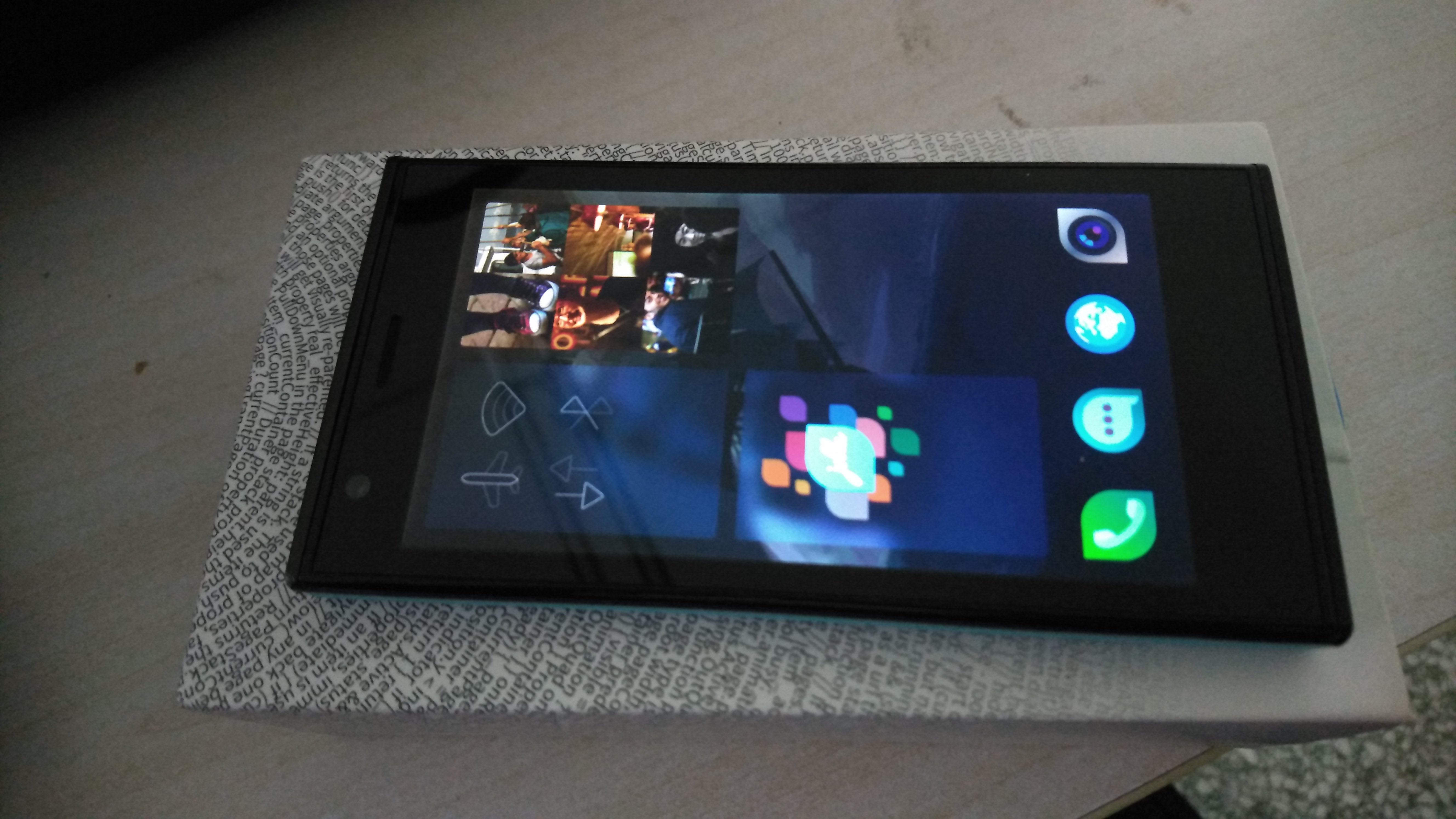
【本文已正式发往TJC】一篇打算发在TJC的长文,关于旗鱼2.x UI的看法。先在这打个草稿
-
@天苯 额,这看着好乱啊…
-
@天苯 我觉得在现有的基础上把通知界面的天气去掉,换成一排可自定义的快捷方式就挺好的。
-
@all-to-be-nice 觉得三列显乱的话可以改成两列的
-
@天苯 patch这么神奇!
-
@vertexshader 是的,来搞patch啊 [滑稽]

-
@vertexshader @BirdZhang 搞搞搞,搞得好捐助大大的
-
@birdzhang @天苯 支持鸟神搞起。。。
-
@vertexshader Orz,做patch一时爽,后续更新是个蛋疼的问题

-
@birdzhang 就是,不冲突还好,冲突了就比较麻烦了。
-
 2.x没Patch根本就活不下去
 -
白痴玩家(不配称“玩”)根本没有Patch,之前装那个软件了又看不大懂手贱卸载了
-
调查失败,干脆入个Jolla停在1.x收藏了

-
再来一篇好了……等2.1.4正式发布以后再给个建议,虽然估计也会沉……
标题:[Feature Request]Allow users to exchange the positions of Events View and Launcher
tag: #feature-request #launcher #events-view #ui
At the beginning of this year I made a little poll here. Up to now(【时间暂定】) the result is 9 to 10(9 people chose Events View and 10 people chose Launcher). Seems that slightly more people think Launcher is more important, so the UI might not change a lot in the future. However, as you can see, there are still some number of people(including me) think Events View should get higher priority and should be accessed more easily. Thus I think Jolla should give an option to let users choose the positions of Events Views and Launcher. As the default situation is to put Events View beside the home screen and Launcher as an app drawer which can be accessed by swiping up, people who want to access Events View more easily can put the Launcher beside the home screen and access Events View by swiping up with the option I suggest. In other words, I suggest Jolla to give an option to exchange the positions of Events View and Launcher. As I’m one of the people who think Events View is more important, I really wonder if this could be possible. Thanks.
-
八成也要沉。
-
@被遗忘的角落 我了解……
-
貔貅